As a visually impared person, I have some issues with the new site. Many parts of the site are extremely difficult to see, since they lack the necessary contrast and/or of a color that is not highly visible.
I have discussed this issue with Julien in a private message and he agrees with me. It would be beneficial to all of us if we have the input from other visually impaired members. Please if you have anyy suggestions regarding text colors that are more or less visible to you, feature that would allow members to individualize color themes, etc., your opinion would be very helpful.
Please post your comments here where Julien and other members of Team will see them.
Cheers,
James
expat.com Experts Team
New site issues for visually impaired members
James
02 December 2015 14:15:15
11272
gardener1
03 December 2015 05:16:22
675
Completely agree. This pale bluegreen print is very hard to slog through, especially on the paler bluegreen backround. Very little contrast, extremely hard on the eyes. These colors are terrible.
Several other problems as well.
On forum threads the last poster ID is no longer available. Nor is the last post, you have to scroll to the bottom of the thread every time to get to the last post and see who the last poster was. Inconvenient as some threads are quite long. You have to scroll through the whole thing every time some new and unidentified last poster puts up a response.
And it is no longer possible to view a member's post history. Only the last few things they put up, and the rest of it seems to be unavailable. I used member's post history a lot to find things I'm looking for when I can't remember which thread the info was in, but I do remember who posted it. No more. This means a lot of previously posted information is more difficult to find.
Xeeschan
03 December 2015 11:10:06
2325
Another major visual problem is that while writing an email, the font color turns light grey.. It is nearly impossible to see even for the visually non impaired.
I am not sure if anyone else has faced the same problem.
Z
Fred
03 December 2015 13:32:17
27505
Xeeschan wrote:Another major visual problem is that while writing an email, the font color turns light grey.. It is nearly impossible to see even for the visually non impaired.
I'm fine on the computer, but the tablet PC is hard work.
Primadonna
03 December 2015 14:39:53
5311
I just wanted to report the same issue, although I am not visual impaired, the background colors are to pale and when you want to type, the letters are to light.
And I am not happy with to much blank around the pages.
Xeeschan
03 December 2015 14:47:31
2325
I agree with Primadonna..
There is too much blank space and the postings are way too far now. It should adopt a more compact forum-like look atleast in the FORUM section. It's ok to have advertisements, but perhaps they can be moved to a sidebar instead of appearing between every posting..
Z
Primadonna
03 December 2015 14:51:27
5311
I noticed that when a thread gets a reply, you can see that on the light blue color. Maybe also for the individual country forums too on the main page?
Fred
03 December 2015 15:03:08
27505
The 'New' button takes you to the first post, not the first new post.
Primadonna
03 December 2015 15:11:07
5311
This is not what I mean, some forum categories gets highlighted when a reply is posted, like this one.
The individual country forums on the main page not, the continent where the country is located does.
Example: the continent Africa has a bit darker color which mean there are replies while you don't know on which country forum. Somalia is inactive for a couple of months but you cant see it, neither the Egyptian
forum which is quite active.
And I like to see that the "new" button brings you to the latest reply WITH the username of the member who posted it. Just like in the old version.
GuestPoster491
03 December 2015 17:14:57
0
For color deficient folks like me, the online status "dot" on the avatar is near impossible to determine. If it HAS to be red/green, please change the shades to differentiate them more so we have at least a fighting chance of knowing if someone is online or not.
Fred
03 December 2015 23:06:07
27505
I see the site layout has become more compressed and easier to navigate. Has that helped the optically challenged members?
Fred
03 December 2015 23:26:10
27505
Zoom (ctrl + mouse wheel)
The old site had issues if you zoomed in too far, losing the green banner sections, side bar and having to scroll left and right to see the whole of a post.
I've just set my magnification to 500%, and the only loss is the top bar (Tools and so on - they disappear above 150%)
Screen looks really silly at the moment, but even at that extreme magnification, everything is still there.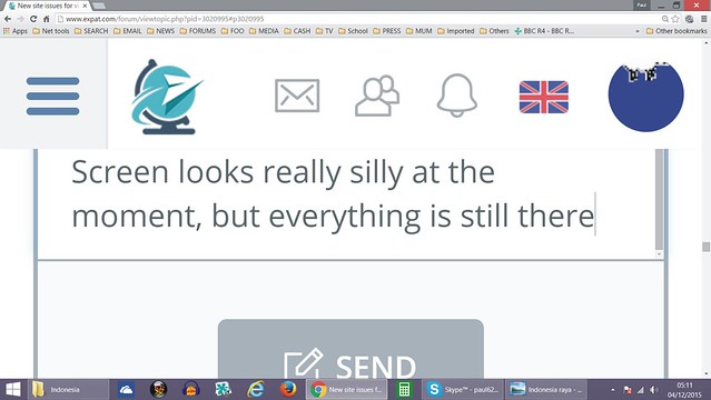
At 200 times, the text is very clear, but the screen is still reasonable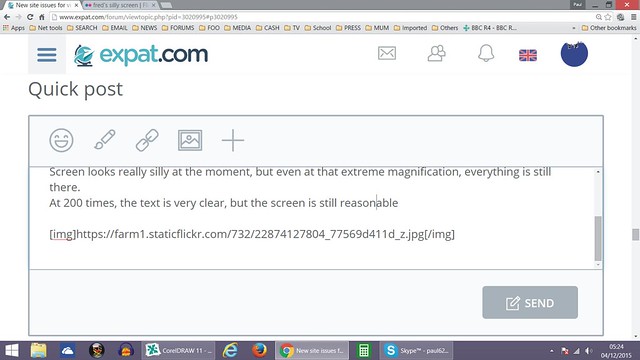
James
03 December 2015 23:48:54
11272
The text typed into the "Quick Post" box is not the problem. The real problem is in the "Your Reply" box in Private Messages, the text there is a much lighter shade of gray, and nearly impossible to see for anyone with a visual imparement. Zoom will not improve that much if at all.
Fred
04 December 2015 03:23:48
27505
PM text colour on my phone is black. Darker than quick post
Xeeschan
04 December 2015 11:24:54
2325
Hey Romaniac,
I noticed this when you pointed this out before as well. I'm using Chrome, and on it online members are green, offline are grey. I havent noticed any red dot as yet.
Is it possible that this is happening coz you are using IE? Or are you using Chrome as well?
Z
romaniac wrote:For color deficient folks like me, the online status "dot" on the avatar is near impossible to determine. If it HAS to be red/green, please change the shades to differentiate them more so we have at least a fighting chance of knowing if someone is online or not.
stumpy
05 December 2015 00:59:36
17635
As an oldie I too am having trouble with the color when replying to PM's same as James.
Gordon Barlow
05 December 2015 20:02:13
1188
Good God. I had just gotten halfway through agreeing with Primadonna, when I pressed the plus sign to italicise a word, and my whole message disappeared. As I was trying to say... the whole thing has been an egregious waste of time, Julien; it has no redeeming features. Some mother's-basement-dwelling techie has cottoned on to the latest silly trend, which has resulted in a completely useless "improvement". The best thing you can do now (Julien) is change it back to the way it was. Oh, and fire the techie! Thanks.
(PS. I'm not risking italics, this time!)
GuestPoster491
08 December 2015 08:48:13
0
Gordon Barlow wrote:Good God. I had just gotten halfway through agreeing with Primadonna, when I pressed the plus sign to italicise a word, and my whole message disappeared. As I was trying to say... the whole thing has been an egregious waste of time, Julien; it has no redeeming features. Some mother's-basement-dwelling techie has cottoned on to the latest silly trend, which has resulted in a completely useless "improvement". The best thing you can do now (Julien) is change it back to the way it was. Oh, and fire the techie! Thanks.
(PS. I'm not risking italics, this time!)
Not exactly the most respectful nor constructive criticism....  It's not like you're paying for the service...
Bob K
08 December 2015 11:17:41
7675
I agree with almost all above.
I am not visually impaired ...just old  and I find the new light colors almost impossible to read.
Also would really like to see who the last post on a thread was from.
I now spend 2x more time to get the same amount of work done on this site and it is not getting any better. I am finding that this must be true of most, at least on the DR site, as our traffic is way down.
Sometimes if it "aint broke...don't fix it"
Bob K
James
08 December 2015 20:40:05
11272
Well good news from Julien. I received a PM from him this afternoon and he'll be back in Mauritius tonight, following a trip to France. He has already asked site developers about the visibility problems and asked them to resolve the problem. Since they haven't done so already, he's going to put the bug in their ear when he gets back. I hope that's going to get us a resolution to the problem in the very near future.
Cheers,
James
expat.com Experts Team
Xeeschan
09 December 2015 08:25:18
2325
Cool! Hopefully we will see some improvements soon!
Z
Gordon Barlow
10 December 2015 18:51:00
1188
romaniac wrote:Not exactly the most respectful nor constructive criticism....
I have been known to criticise Google, Roman, and I don't pay for that, either. I pay my due respects here by signing up for this generally excellent, but grossly underutilised, forum. Constructive criticism does not equate with pussy-footing around the topic. If the blogs' owners didn't want criticism, they would not have invited it. On my own blog, I don't invite comments of any kind. That avoids that problem!
Fred
10 December 2015 23:40:19
27505
Gordon Barlow wrote:If the blogs' owners didn't want criticism, they would not have invited it.
I know they do want constructive comments and complaints.
When one of these threads started a short time ago, I received a PM from the team asking me to add any comments about problems I'd noticed.
The goal is to get the site right, so these threads are welcome.
GuestPoster491
13 December 2015 06:10:31
0
Gordon Barlow wrote:I have been known to criticise Google, Roman, and I don't pay for that, either. I pay my due respects here by signing up for this generally excellent, but grossly underutilised, forum. Constructive criticism does not equate with pussy-footing around the topic. If the blogs' owners didn't want criticism, they would not have invited it. On my own blog, I don't invite comments of any kind. That avoids that problem!
I agree, constructive criticism doesn't equate with pussy-footing around a topic. However referring to the developers of this site, which mind you has made it a successful one over the last 10 years, as a "mother's-basement-dwelling techie" and calling for them to be fired is downright abusive and insulting. Would you like someone with not the slightest amount of knowledge in your domain to come dump on your occupation or efforts? Try walking a mile in their shoes first...
There is a lot of room for improvement with the site. Most, if not all of us, are providing comments and criticism in order to improve the site, not to insult or demotivate Julien and his team. Again, I remind you this is a free platform, and you are not owed anything by anyone.
P.S. - Google is making money off you in ways you don't even realize, so I highly doubt a multi-billion dollar giant like them is too concerned about your rants.
Gordon Barlow
13 December 2015 21:07:09
1188
romaniac wrote:... referring to the developers of this site, which mind you has made it a successful one over the last 10 years, as a "mother's-basement-dwelling techie" and calling for them to be fired is downright abusive and insulting.
I have always presumed that it's not the owners that actually do the techie stuff. With most forums, that's the case - at least in my observation. I would be grateful if some "insider" would tell me. If this forum's owners really do do all their own actual uploading, then I hereby apologise to them, with complete sincerity, and ask them to believe that I didn't intend to insult them. But - if that is the case, how come Romaniac knows and I don't?
To whom it may concern: A tip for the future... Please let your members know if you yourselves are doing all your own tech work. I myself live in total ignorance about these things. A friend of mine put my blog up on the Web several years ago, and I haven't a clue how to change what he put there. (If you look at my blog, that is painfully obvious.)
James
13 December 2015 23:52:37
11272
Hi Gordon,
First of all, as you are no doubt aware expat.com is not just a change in the format of Expat-blog, but rather a changeover to a completely new site which is considerably more complex. For whatever reasons Julien chose to release the new site now, after several months of delays. I suspect that it was his desire to have the new brand up and running before the end of 2015 in order to enter the New Year on the new site. That has caused some minor glitches as it probably would for any similar site change.
You are correct, it is not Julien who handles the technical support side of the operation, but those that do are working on his direct instructions. There are still a number of issues to be resolved, the visibility problem is just one of them. Julien and I have had several conversations regarding the problems and he is in the process of prioritizing the order in which those necessary "tweaks" are going to take place. He assures me that they're working on them as quickly as possible.
If you do have any concerns, or suggestions as to improvements you can direct them via e-mail to [email protected] where they'll probably be seen a bit quicker than here on the forum.
Cheers,
James
expat.com Experts Team
James
14 December 2015 16:53:10
11272
Hello everyone,
I'm sure you'll be glad to see that the issue of the visibility of various parts of the new site has now been resolved.
I have a visual impairment, and so far I'm quite pleased with the improvement. Please if you still are having any problems with a specific part of the site report them here or by e-mail to [email protected]
Cheers,
James
expat.com Experts Team
GuestPoster491
30 October 2016 05:40:14
0
I've noticed in the last days the font size in the menus have been reduced. I'm finding it rather hard on my eyes. Anyone else have issue with it? Why was this change done?
Romaniac
Xeeschan
15 November 2016 13:10:02
2325
Hi Romaniac,
The font has visibly decreased. While it was noticeable in the beginning, it has not given me much trouble as I got adjusted to it after a couple of days. Not sure if you are adjusted too.
It still seems legible, though a bolder,more prominent font would be helpful.
Z
romaniac wrote:I've noticed in the last days the font size in the menus have been reduced. I'm finding it rather hard on my eyes. Anyone else have issue with it? Why was this change done?
Romaniac
GuestPoster491
18 November 2016 06:20:01
0
Xeeschan wrote:Hi Romaniac,
The font has visibly decreased. While it was noticeable in the beginning, it has not given me much trouble as I got adjusted to it after a couple of days. Not sure if you are adjusted too.
It still seems legible, though a bolder,more prominent font would be helpful.
Zromaniac wrote:I've noticed in the last days the font size in the menus have been reduced. I'm finding it rather hard on my eyes. Anyone else have issue with it? Why was this change done?
Romaniac
I still find it difficult to read, but part of that is possibly my need for new glasses. In any case, choosing to go down to such a small font is a questionable design choice. I shouldn't need to use the browser zoom on a 23" monitor.
Xeeschan
18 November 2016 06:37:03
2325
Well, considering history, getting that pair of glasses will be the most viable solution! -_-
romaniac wrote:I still find it difficult to read, but part of that is possibly my need for new glasses. In any case, choosing to go down to such a small font is a questionable design choice. I shouldn't need to use the browser zoom on a 23" monitor.
Subscribe to this topic
Articles to help you in your expat project

Working in Taiwan
Working in Taiwan depends on your skill set and the job you seek. Expats can find a wide range of jobs around the ...

Getting married in Qatar
Getting married in Qatar could be a hassle for newbies. However, knowing the right procedure and information can ...

Working in the Dominican Republic
If you are looking for a job in the Dominican Republic (DR), here are some tips and suggestions. Job hunting can ...

The health system in Mauritius
Health is a major issue when moving abroad. Are expats eligible for the Mauritian health system? What are the ...

The healthcare system in the Dominican Republic
If you are moving to the Dominican Republic, one of your primary concerns is likely to be the healthcare system ...

Marriage in Brazil
Brazil can be a romantic country, and you may want to marry here. Perhaps you even want to remain in Brazil ...


Open a bank account that suits you
Discover the best international banks to manage your money securely.


Live your expat project without any stress thanks to advice from expats
Register
"